The Importance of Color to create best Home Interior Designs
Interior color impacts and influences space and the people in it. In any residential or commercial area, you come across color used on the walls, ceilings, flooring, furniture, frames, countertops, and almost every nook and corner. Thereby, choosing appropriate colors becomes an important element of interior design as it makes or breaks the look of a space. When the best interior designer has a vision for the home, office, institution, restaurant, etc. to a great extent the final ‘WOW’ moment depends on the way colors come together to create the emotion.
Today the top interior design firms in Mumbai and other cities understand color psychology plays a key role in creating the most beautiful home interiors. It also induces the desired effect when rightly used in commercial establishments. There is a technique behind blending colors. Once you get the interior color combinations right, any home or expanse would appear a piece of art. The color wheel technique explains how different colors can be used together: –
1. Complementary
Complementary colors create a strong contrast and thereby are used as accent colors to draw immediate attention to any space. These colors are opposite on a color wheel and require to be used sparingly and cleverly. Complementary color pairs include are red-green, yellow-purple, and blue-orange.
2. Split-Complementary
This is a slight deviation from the complementary color scheme. It does not use the exact opposite color but uses two colors adjacent to its opposite. This way though the contrast remains, it is of a lesser degree and easier to work with.
3. Triads
Triads form a triangle on the color wheel, for example, a combination of orange, green and violet. When using triads it is best to use one color as a base and the other two as accents.
4. Analogous
These are groups of colors that are next to each other on the color wheel like blues and greens. They are easy to work with as they combine to provide a more serene look.
5. Monochromatic
This is one color that ranges from shades of light to dark.
6. Cool and Warm
While blue, green, purple are cool colors; reds, oranges, yellows, and pinks are warm colors.
7. Non-colors
The top interior designers in India are often seen utilizing non-colors to design a space. The blacks, whites, greys, beiges, and browns are grouped as non-colors.
NOW that you know how to mix colors, it is equally important to understand how the use of color can affect you. Color is believed to influence the mood and behavior of an individual. Everything in our surroundings from the sky to the earth, to the trees, and oceans is filled with beautiful colors. When these and other colors enter your offices and homes, it can stimulate your productivity, reduce stress levels, and improve overall health. Having understood this, it is essential to go beyond color trends. The best home interior designs and commercial places use color palettes to create the right ambiance. Whether the décor looks inviting, or invigorating, or relaxing, color most certainly invocates a feel. Here are a few basic color palettes that top interior designers in India use to create the right impression and perfect environment that clients demand: –
The Neutral Colors
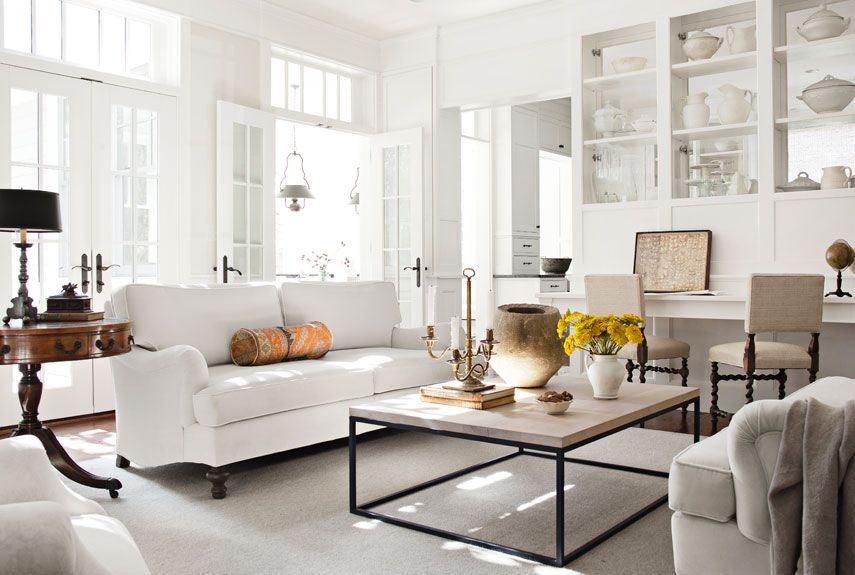
Neutral colors are good for any room in the house. They can also serve as a good accent. Some of the neutral colors used in interior designing are,
White – For a refreshingly clean look. It makes the room appear more spacious, light, and airy.
Black – Feel grounded. Black is used in larger spaces or as an accent. Excessive use of black must be avoided especially in areas where you spend majority of you time since it can cause a feeling of gloom and even lead to depression in the long run.
Metallic – Sparkly metallic colors add instant glamor and spark the mood.
Grey – Less formal and detrimental than black, a hue of grey if cleverly used can reflect the occupants’ conservative nature and add a feel of comfort.
Brown – Induces a feeling of nature, adding depth and warmth.
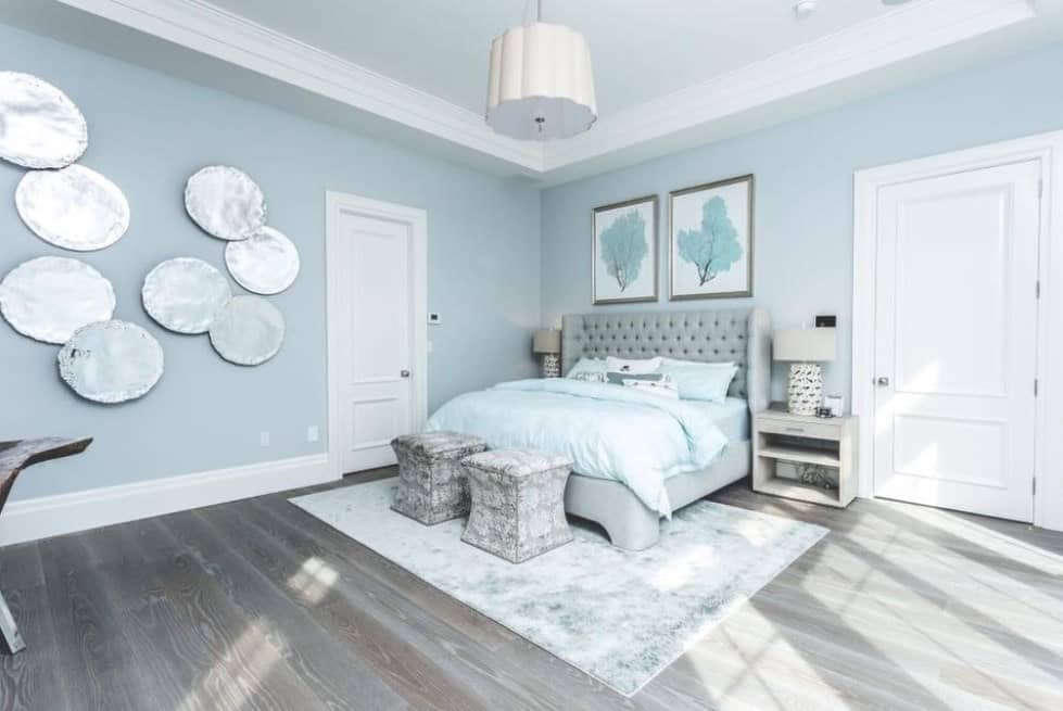
The Cool Colors
The cool colors are preferred in bedrooms. Sometimes they may be used in living room to give it a soft inviting feel.
Green – It is associated with a calming effect and helps to relieve stress.
Blue – It creates a cool calm effect that helps to improve meditation and even reduces blood pressure.
Purple – The color of royalty it spells luxury living.
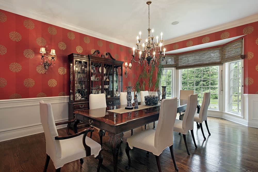
The Warm Colors
Warm colors are often seen in entryways, dining rooms, kitchens, children’s rooms, exercise rooms, and bathrooms.
Red – It increases the energy level of the space. It stimulates love, passion, and even hunger. Orange – Not as intense as red, orange evokes excitement and enthusiasm.
Pink – Fresh, sweet, and soothing it is often perceived as a feminine color.
Yellow – This is the color of happiness associated with bright sunshine.
FROM using the right color combinations to understanding color psychology, top interior designers in India, are now creating contemporary designs especially for homeowners who say, “Home is where love resides, memories are created, friends always belong, and laughter never ends.” Here are the most sought after looks created by mixing color.
Classic Elegant
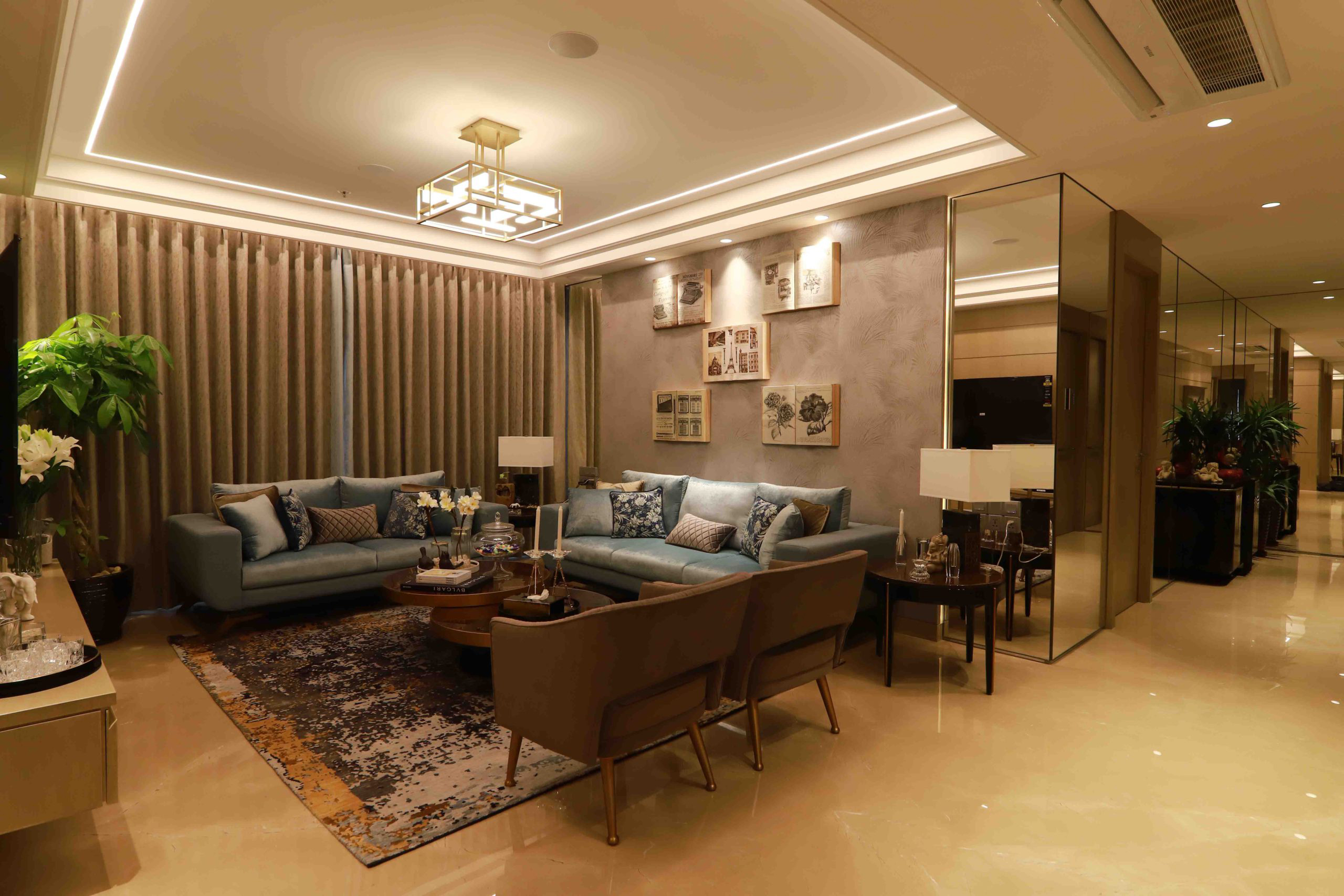
Neutral home decor using white, grey, beige, and black helps to create classic elegance. Interior designers in Mumbai use a lot of neutrals like white, beige, ivory, taupe, to get the classic ‘effortlessly elegant’ and ‘never out of style’.
Modern Contemporary
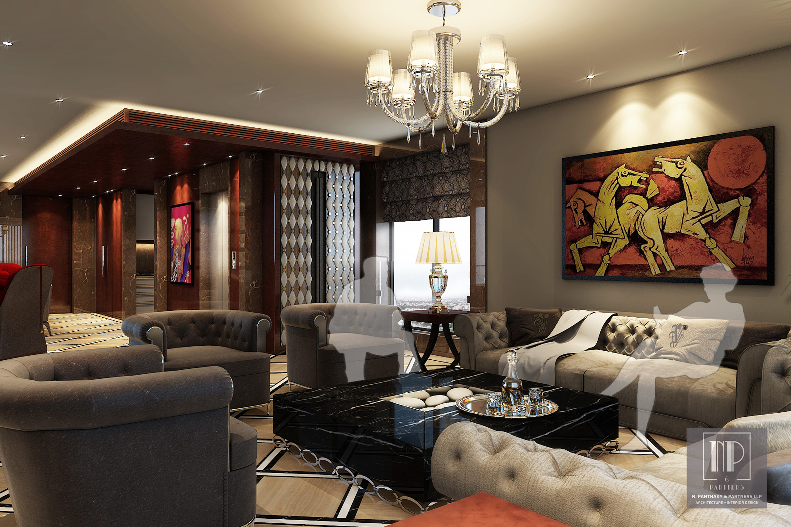
This décor either uses a palette of black, white and grey or tones of rust, red, brown, orange, olive, and indigo. These colors blend with the design elements mostly in glass and metal.
Black and White
Though used in clubs and commercial areas, the age-old black and white combination has found its way into many designer homes. From luxury home designs to minimalist interiors, several combinations of black and white can create a complete everyday look that is visually striking.
Bold and Beautiful
Vibrant room color and home interior ideas come from the flamboyant homeowners who are expressive and extroverted too. They don’t shy from color and are ready to adopt new bold color schemes that break away from the ordinary. Bold designs are best left in the hands of professional interior designers who know how to create a bold look without it appearing garish.
Eye Pop
This look is the fun look. It combines walls, floors, countertops in neutral colors with accents in bright eye-popping colors. The beauty of this décor style is that it is most easy to change. Throw in colorful cushions or change a throw and voila you have a new look. Even a bright chair, a colorful cabinet, or a chandelier can become an eye pop. It just needs to draw your attention to it as soon as you walk into a room.
WHILE color and design will continue to be of prime importance in interiors, today designers are full of new ideas on how to arrange for ‘home office’ within an existing available space. Interior designers in Mumbai and other metro cities are ready with home office ideas incorporating the right color to create the perfect space. They understand color reflects the clients personality and incorporate the right mix to bring energy to the work space. Pale oak, to light blue, to salmon, these colors are chosen for home offices to boost creativity, increase productivity, and provide happiness. Redoing a partial space in a room or converting an entire room in the house to inspire you to work without feeling cold and isolated, is what the interior designer will deliver.
As color is the power that directly influences the soul, it’s time to get it RIGHT!


